
Perhaps I’m one of the last people in the card collecting planet that has even come to grips with the possibility of even thinking about writing a review of this set, but I can deal with that. You see, what good is my cracking of the wax if I can’t at least expound upon my own opinion on what I’ve just cracked, even if it is a little behind the times. Many thoughts and opinions of this set have already been instantly been sputtered out on that tweeting bird site and that other book of faces page. Damn you, sign o’ the times!
That’s fine, though. I’ve already shared some of those instantaneous thoughts in those heavily used places. However, with only a few allotted characters per thought, it’s time for me to flood the wordscape with a seemingly unending monosyllabic vocabulary relating to nothing other than what I think of this year’s Topps flagship.
Now that I’ve wasted two bloated paragraphs telling you what I’m going to do, let’s get down to actually doing it, yeah? OKAY!
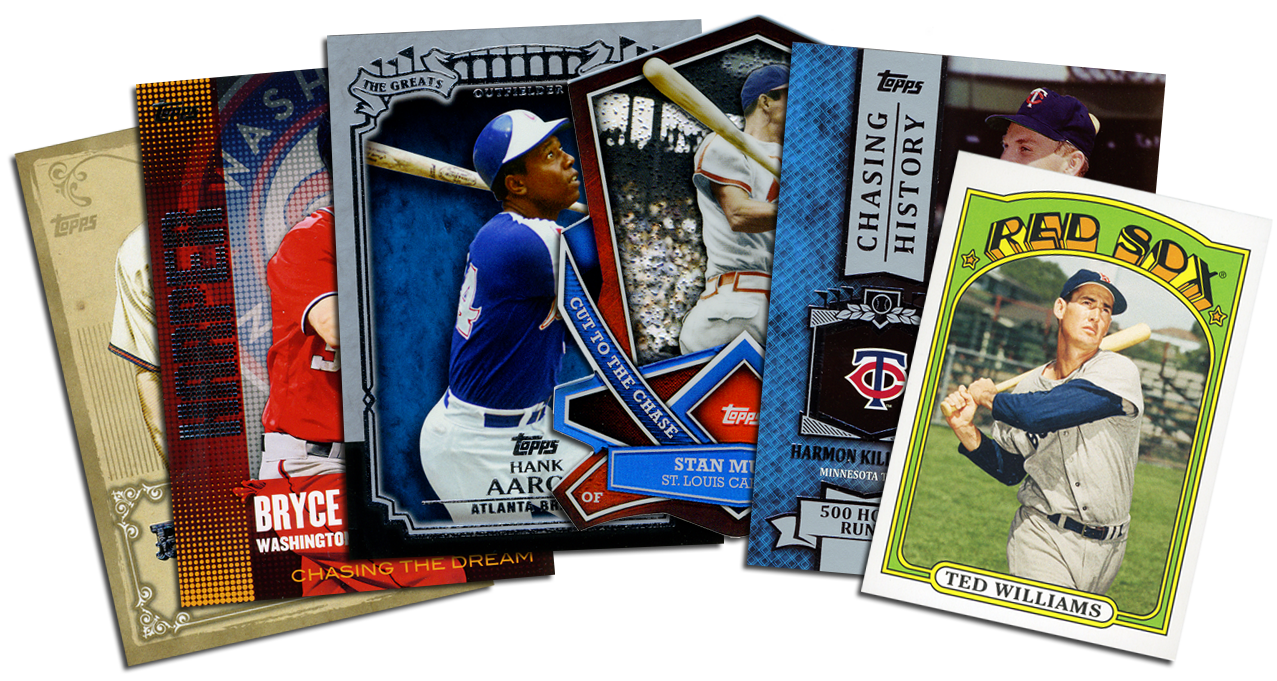
As in years past, I am not collecting the flagship set–which consists of 330 base cards. Instead, unlike in years past, I busted through an entire jumbo case of the stuff. Doesn’t sound very logical of a guy not bothering with putting together any sort of set from the product. If you weren’t here for it, the explanation is that I used ’13S1 for my first ever group case break–a successful one at that. I attribute the success to what Topps brought to the table in this year’s iteration of their annual release. The case break is also one of the reasons it’s taken me so long to get to the review.
Another year, another theme. After Diamonds and Gold, Topps has given us something to “Chase.” Continuing with what I assume must have been successful programs in the past, Topps has dotted this year’s flagship with all sorts of interactive things for collectors to get in on. There’s a wrapper redemption, an online code game and even a special LCS redemption program. Topps is even giving collectors the chance to win $1,000,000… all part of “The Chase.”
Ya know, I have a nephew named Chase. This might be a good year to get him hooked on cards.
Anyhow…
ALL YOUR BASE
There was buzz aplenty when Topps first leaked their ’13 flagship design last year. Most of the buzz was drenched with excitement and positivity while, as per the usual, some was dripping with scorn and negativity. I, for one, started off skeptical of the design but grew to embrace it. Much like with Topps’ football flagship last year, this year’s baseball design incorporates a major theme of the sport–the very field on which the game is played. I believe it was well executed and is a much needed punch in the direction that Topps had been taking for the past decade or so.
The card stock, printing process or both seem to have changed this year. The finish on the cards seem to be less glossy than even last year’s set. Whether this was a cost saving move, an intentional change or just all in my head, I like it. I’ve seen some folks say that this set accepts autographs without any prep work and, to me, that’s a great thing.
There is one slight gripe that I have with the design, however. I am a graphic designer, so things like this tend to pop out at me more than many others. This little complaint may seem insignificant to most collectors–in fact, when polled, most of you did not agree with me. That’s the great thing about science–there’s no one right answer (Big Bang quote #1). Topps even chimed in with me and stated that they like their design. Well, they should! If not, why waste the time and money on such a large print run? Of course, this is the same company that did a fairly large flagship run in 2008. We all remember 2008. My tiny little problem with the design is the faded striping that appears on the bottom right corner on the front of the cards. To me it somehow cheapens a really solid design and doesn’t seem to really fit in with the look and feel of the set as a whole. I would be more accepting of that design element if it were extended to the opposite side of the card. I could even deal with it as a solid background color or even eliminated altogether.


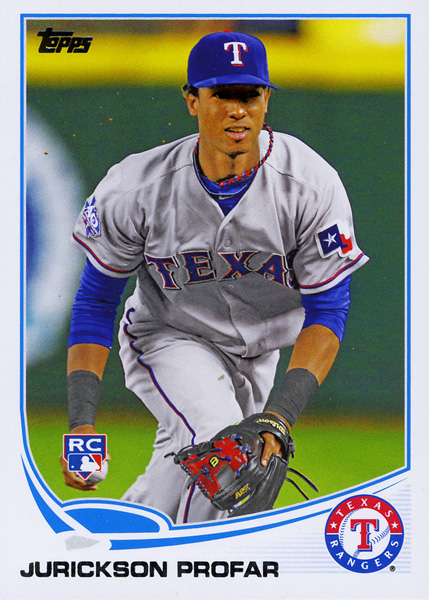
Of course, there are some other little nitpicky things that aren’t much of a big deal but still kind of grate at me, such as the floating RC logo.
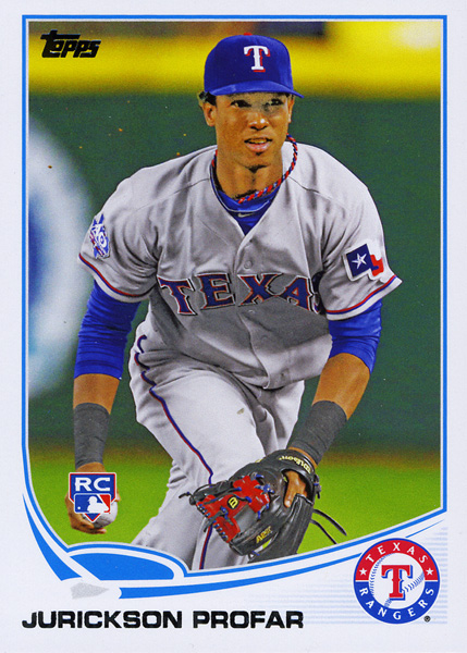
The RC graphic, as shown in the card above, seems to be in a strange location. It looks as if it’s just kind of floating there. The fact that it’s sitting on top of Profar’s hand is bad enough to these eyes, the graphic itself isn’t really anchored or evenly aligned with anything. My suggestion would be to place the RC graphic up in the right hand corner equally aligned and anchored with the Topps logo.
Speaking of the Profar card… let’s take a closer look at it, shall we?

Something else about this card seemed a little off to me the first time I looked at it. Within seconds, I came up with a plausible theory as to what had happened. Take a look at his eyes. Something seems–off. Doesn’t it? As if Topps had drawn in the eyes by hand or pasted someone else’s eyes over Profar’s.
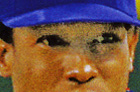
See what I mean? It just looks unnatural. Here’s my guess as to what happened. My thought is that the image they used was likely either the best they could find or the only usable one they had on hand but the eyes were shaded out by his cap. What would a photo manipulator do to manage this situation? Any graphic designer worth their training on Photoshop would use a skilled blend of the Dodge/Burn/Sponge tools to eliminate the shadow. I myself used those tools to reverse the card back to what I believe to be the original image.
If this were indeed how the original image looked, I can see why Topps would have wanted to fix the overly dark shade hiding Profar’s eyes.
In order to supply you with another example of how this works, I took the liberty of finding another photo of Profar and executing the process I believe Topps used to manipulate Profar’s photo. The first image is the original while the second is the manipulated version.
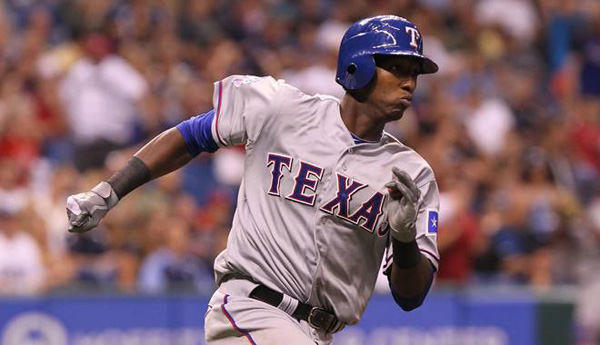

As I say, it’s just a theory, and it’s just a little nitpick of mine.
GET BACK
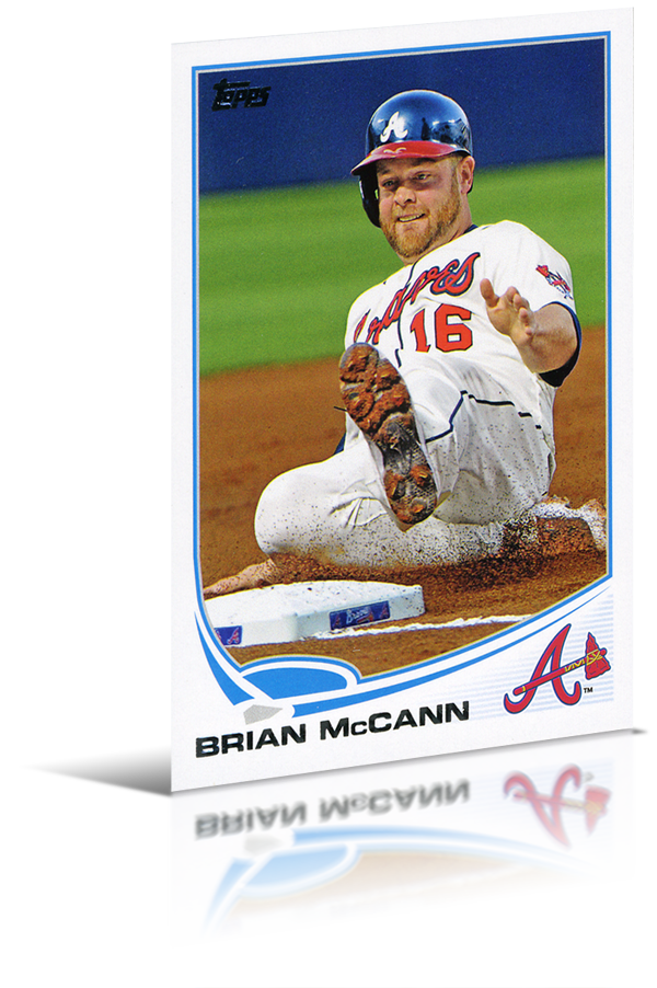
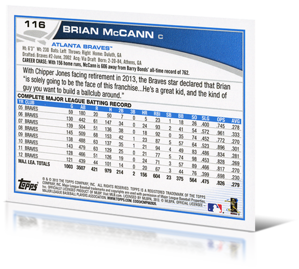
The sign of a strong design, especially in trading cards, is how the theme translates to the text-heavy back of the card. Once again, Topps did a tremendous job of carrying the elements from the front over to the back. You’ll find the usual statistics and trivia, although this year Topps added a “Career Chase” blurb which denotes a specific mark of a specific statistic that a given player is “chasing.” For instance, Mitch Moreland is 722 Home Runs away from Barry Bonds’ all-time record of 762. Let us not be confused about the actual all-time Hits statistic, though. Much has also been said about Topps’ flagship card numbering system. They have used the “hero/century” system for a number of years. This is the system in which a card number ending in 00 is reserved for top players. Let’s say, as an example, you might find Derek Jeter sitting at #100. It seems this year that Topps has abandoned that system. Card number 100 belongs to Mike Moustakas, 200 to Scott Downs and 300 to Daniel Murphy. All fine players, but not necessarily worthy of the “hero/century” numbering system. What Topps has done this year is make use of player jersey numbers. Brian McCann, for instance, wears the number 16. You’ll notice that his card number ends in 16 (#116). More prominent players get their jersey numbers as their card numbers outright. For instance, who do you think Card #2 belongs to? If you said “Derek Jeter,” you’re onto something! If you’re thinking that Joe Mauer is Card #7, you’d be wrong. Topps has flat out retired that card number. In an effort to continue to offer exactly 330 base cards, they extended the numbering to 331 to fill in for the missing #7.
PARALLEL UNIVERSE
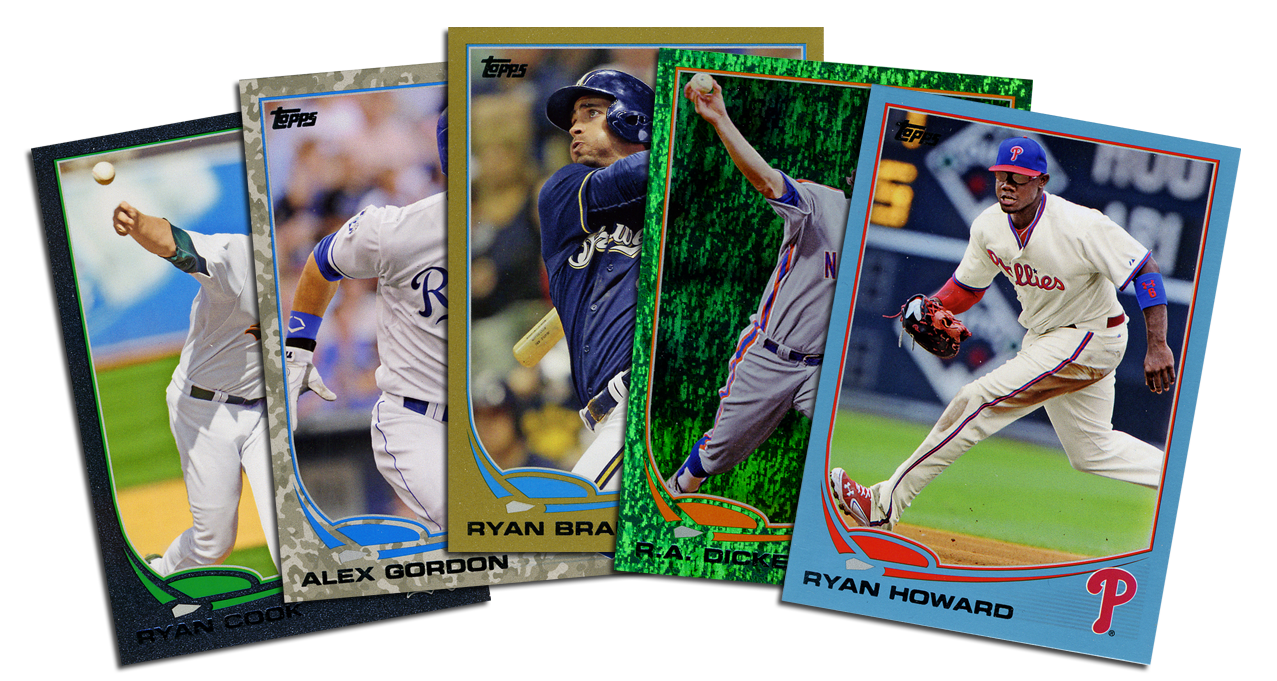
One of the advantages of busting open a jumbo case of this set was that I was able to see many of the different parallels that were offered. The variations that I pulled were the Gold, Black (which has a kind of textured look to it), the new Camo and the new Emerald Foil. You’ll also notice that I have a WalMart Blue. Okay, I confess. I also busted a blaster. I couldn’t wait for my case and I was weak. What would you have done? There are also Target Reds, Toys’r’Us Purples, Pinks and wrapper redemption Silver Slates. Oddly enough, framed Silk Collection cards are listed as parallels this year.
INSERT JOKE HERE
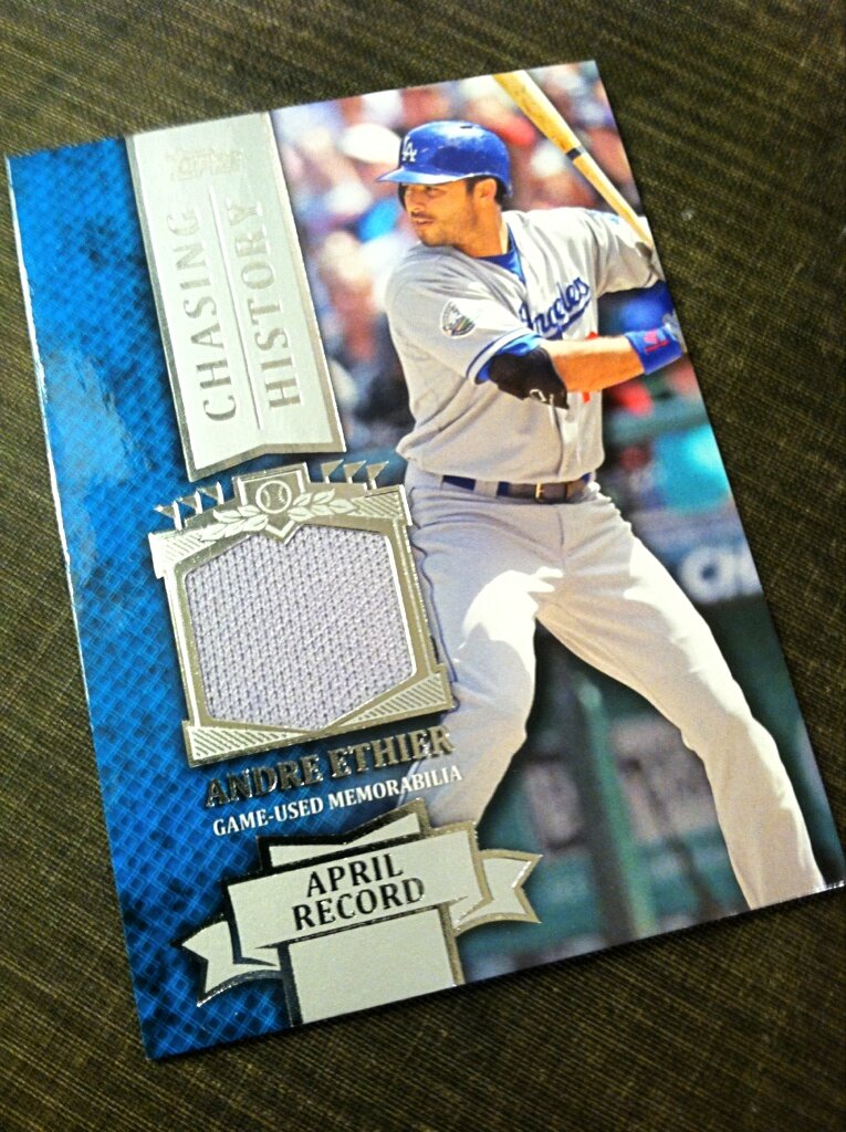
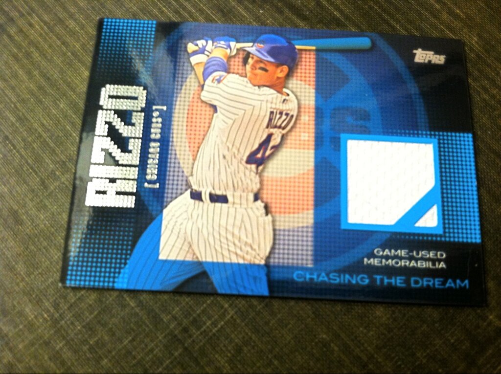
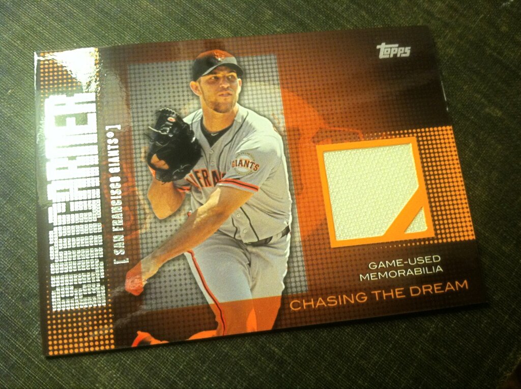
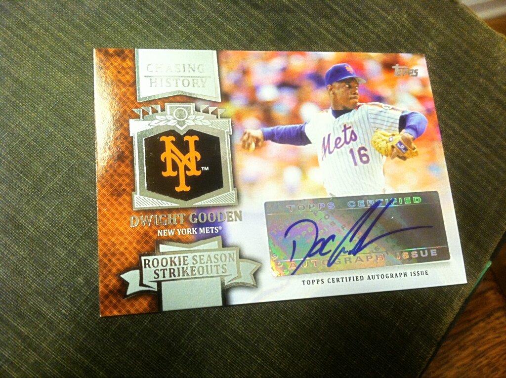
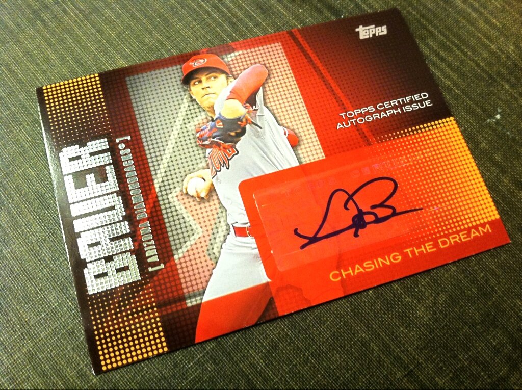
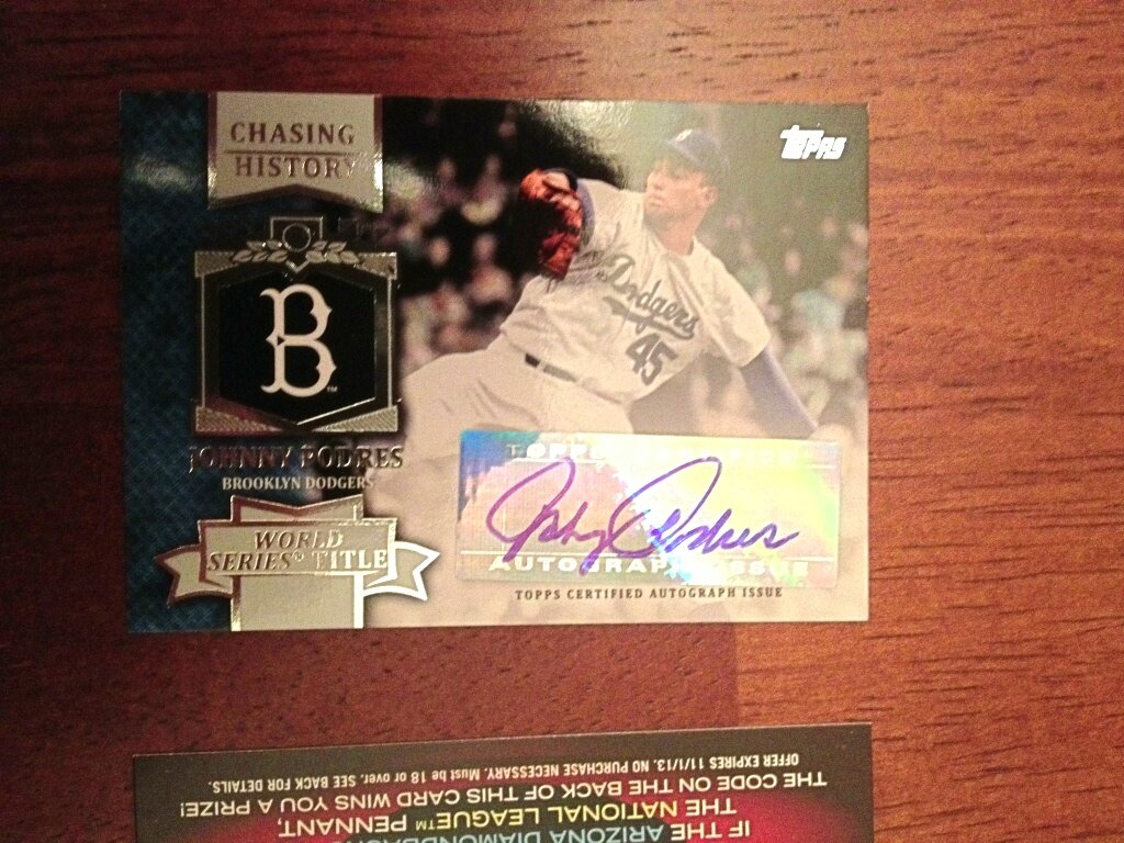
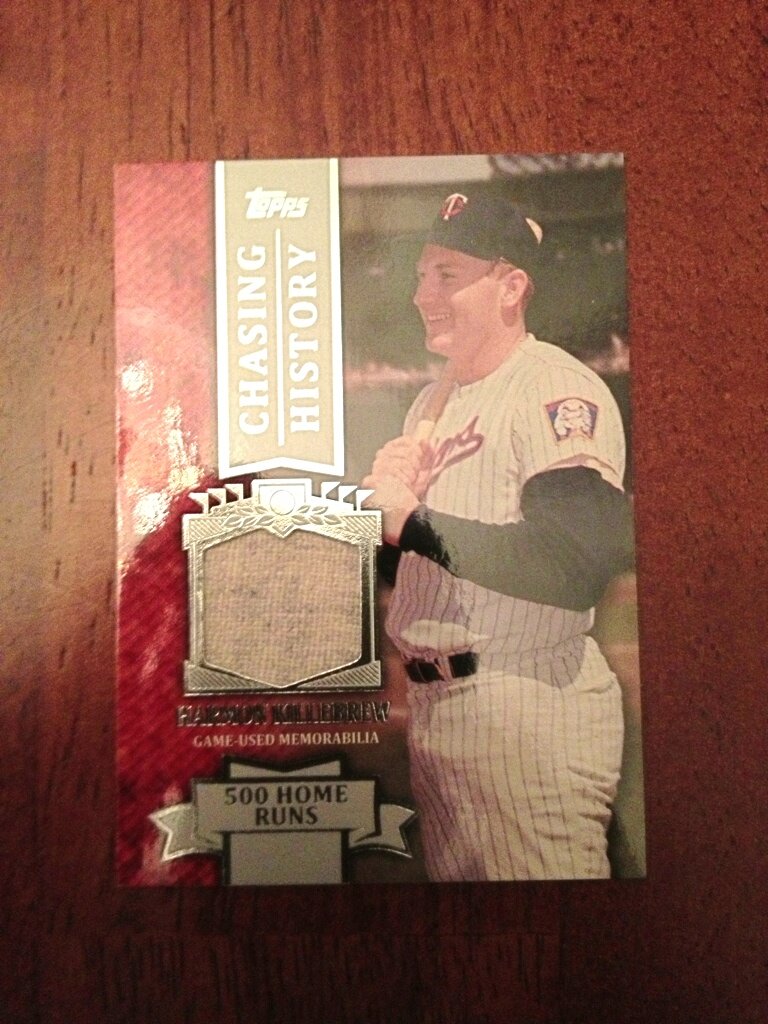
Another advantage of conducting a case break is the ability to pull a good amount of inserts. The Calling Card set actually looks a lot nicer in person than they do on screen while the Chasing the Dream cards almost look worse in person. “The Greats” is a great looking insert presented on thick and sturdy card stock while the Cut to the Chase die-cut set is slick, chrome-y and refractor-y. The Chasing History set, much like the Chasing the Dream set, appears to be a throwaway version of its higher-end GU and AU counterpart while the 1972 minis are fun to pull. To me, inserts usually just serve as nothing more than pack filler, but this year I believe Topps made good use of them without going too overboard. “The Greats,” “Cut to the Chase” and the ’72 minis would be worth “chasing.” Ahem.
THE HITS
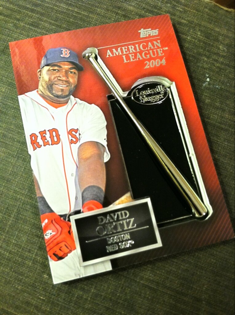
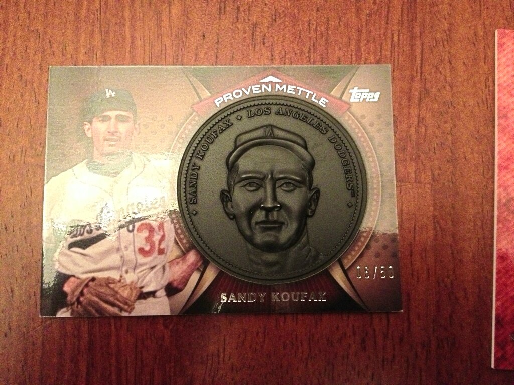
Perhaps the biggest advantage to breaking a jumbo case of ’13S1 is pulling some impressive hits. In fact, the very first two hits I pulled were incredible. There were some lackluster GUs and AUs to be had, but for the most part I was thrilled to have them in hand–if only for a few brief seconds. The autographed and jersey/bat-embedded versions of the insert sets were nice to pull but were nowhere near as awesome to pull as the super huge and monstrously thick Cy Young and Silver Slugger cards. I didn’t have toploaders wide enough for them!


FINAL SCORE
For me, it seems that the excitement for the release and subsequent arrival to my home was completely justified. While this won’t go down in history as the greatest Topps flagship set in history, I take it as a sign of better things to come from them. It’s apparent to me that Topps is listening to their loyal collectors and vendors alike while also making strides to improve and innovate. While the manufactured relic is something I may never collect, the newest versions for 2013 are some of the better ones I’ve seen. As long as Topps continues to improve their product, listen to their audience, appease the MLB and MLBPA and come up with new innovations, they’ll have at least above average flagship products for years to come. The design is solid, the photograph selection is excellent, the inserts seem a bit more collectible than usual and the continued interactivity with collectors is a huge plus this year. A few design nitpicks here and there knock the score down just a touch, however. Yes, Topps, you’ve hit a home run this year, albeit an in-the-park Home Run with a close call at the plate. Keep up the good work, Topps!
UP NEXT
Topps online exclusive 2013 Turkey Red ships this week and I’m conducting a 10-Box break. I’ve got just two teams left if you’re interested! 2013 Heritage is also on the way in a couple of weeks and I’m hosting a 2-box group break BoBuBingo–a fun game of bingo in which you can snipe pulled hits from other contestants. I’ve got plenty of spots available! I’ve even got a deal on the Tigers slot right now!

Reblogged this on The Wax Fantastic and commented:
For anyone who’s already got, or is considering getting, any 2013 Topps Baseball Series 1, he’s the best review I’ve read so far, courtesy of Crackin’ Wax… Enjoy!!